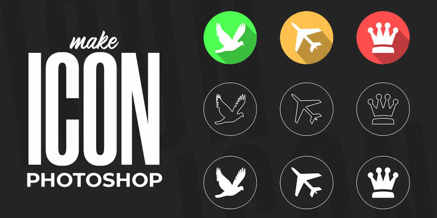
Icons and logos serve as the bedrock of visual identity, encapsulating brands, products, and ideas in a concise and unforgettable manner. Whether you’re an entrepreneur aiming to forge a robust brand identity or a designer sharpening your craft, proficiency in the fundamentals of icon and logo design is crucial for effective communication and brand acknowledgment. Within this blog, we’ll delve into the core principles of crafting icons and logos in Photoshop, equipping you with the skills to fashion unique and influential visual identities.
Understanding the Basics
Prior to delving into the depths, acquaint yourself with the fundamental tools of Photoshop:
- Shapes – Rectangles, circles, triangles – your fundamental building blocks! Utilize the shape tools to establish basic geometric foundations.
- Paths –
- More versatile than predefined shapes, paths afford you the freedom to fashion custom shapes and manipulate them at will. Employ the pen tool for meticulous precision and control.
- Layers – Visualize layers akin to transparent sheets arranged in a stack. Each element occupies its own layer, enabling you to edit and reposition them autonomously.
- Colors – Select colors that resonate with your brand or convey the intended message. Experiment with the color picker tool and delve into complementary color schemes for added depth and impact.
Sketch it Out – Before transitioning to digital tools, grab hold of pen and paper. Sketch out several concepts for your icon or logo, taking into account its purpose, target audience, and the intended message. Remember, simplicity and recognizability are often paramount.
Building Your Masterpiece – Now, launch Photoshop and initiate a new document. Drawing inspiration from your sketches, utilize shapes or the pen tool to initiate the fundamental outline of your icon or logo. Bear in mind, simplicity reigns supreme – eschew excessive detail at this juncture.
Refining Your Creation – Employ the path tools, such as “add anchor point” and “delete anchor point,” to refine your shapes and craft seamless curves. Feel free to experiment, remembering that you can always undo any changes if necessary.
Color Time – Color your shapes with solid hues or gradients (employ the gradient tool) to infuse additional depth. Keep in mind that colors evoke emotions, so exercise discernment in your selection.
Adding Details (Optional) – Seeking to infuse a hint of personality? Employ smaller shapes, lines, or the brush tool to craft details such as highlights, shadows, or textures. Ensure minimalism prevails to preserve readability.
Text Integration (Optional) – For logos, contemplate integrating text. Opt for a clear, legible font that harmonizes with the overall design. Experiment with text size, positioning, and even effects such as drop shadows to enhance dimensionality.
Final Touches and Export – Refine the overall balance, spacing, and composition of your design. Ensure all elements align neatly and effectively convey the intended message. Once satisfied, export your creation! Opt for a high-resolution PNG format for web usage or a vector format (EPS, SVG) for enhanced editing flexibility.
Conclusion
Icons and logos serve as potent instruments for conveying ideas, forging brand identity, and leaving a lasting mark on your audience. Through mastering the fundamentals of icon and logo design in Photoshop, you can fashion unique and influential visual identities that distinguish themselves in a competitive landscape. Thus, embrace the principles of research, sketching, shaping, refining, and implementing, allowing your creativity to flourish as you sculpt icons and logos that endure in memory.


Leave a Reply
You must be logged in to post a comment.